Case study: GreenMatch.co.uk
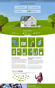
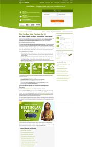
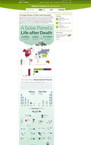
Giving a trusted green energy website a powerful identity and refined style that is configurable at scale, spread over 155 domainsHigh resolution, full-length screenshots
On this page:
Timeline
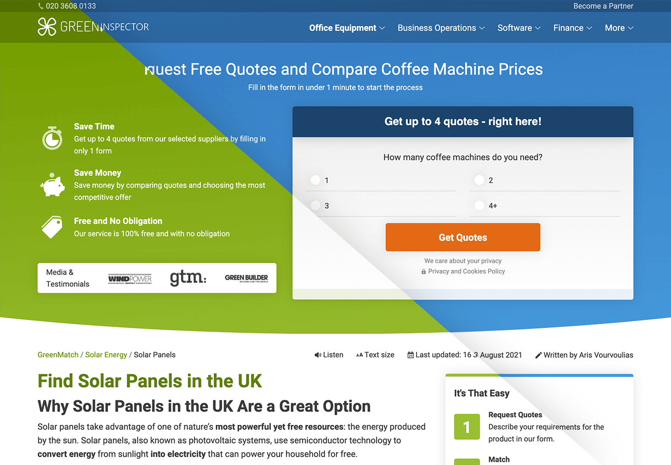
This project involved two brands, GreenMatch and Market Inspector, spread across 155 domains. The main focus was the more profitable GreenMatch, but the project included merging the two brands into a single content management system.
Both brands were founded in 2014. GreenMatch's mission is to connect people with green energy installers, while Market Inspector is servicing business-to-business operations such as coffee machine rentals.
I have worked on this cluster of websites between 2019 and 2021, with the most important changes happening in 2020/2021, and the websites ending up being sold to an investment group.
Attila was a key driver of value during his tenure at AWM. As a highly adept web professional, his consistent determination and aptitude for swiftly acquiring new skills position him as an ever-evolving asset. He possesses profound expertise in the intricate workings of websites and apps as well as how users think and act.
Mark Thorsen, CEO, AWM Network
Problem diagnosis
At first, I had only developed content elements for GreenMatch (at that time, I was in an SEO position at the company), but soon after management trusted me with the complete redesign of the websites.
Apart from the usual 'what is the best interface we can do that serves the users', there were two further challenges present that needed to be solved:
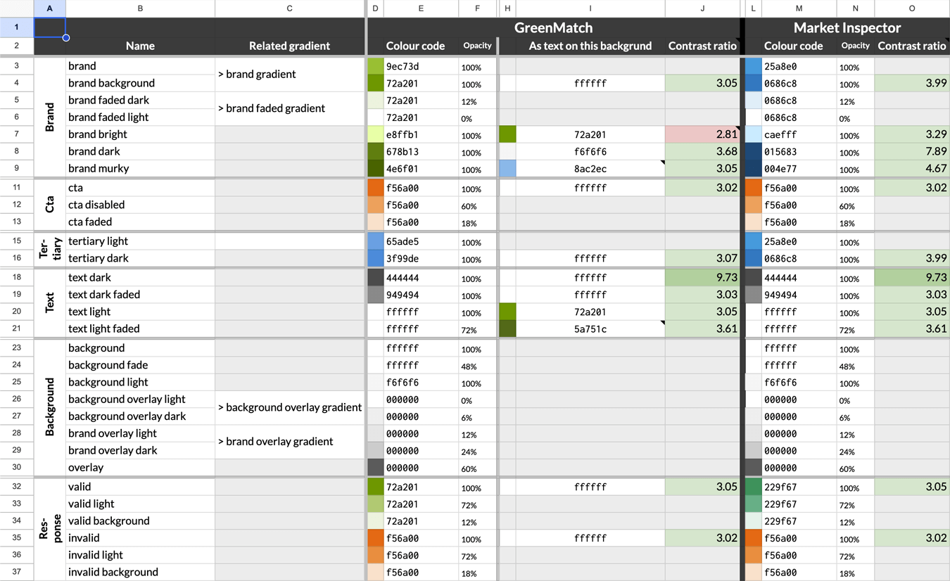
- The 155 domains were scattered across different implementations, and the two brands operated on separate servers with content management systems lacking interoperability. As such, the content had to be transferred from system to system at the same time as it became modernized. The new CMS was set up for standardization, to serve multiple brands by only changing configuration and content.
- Even though development would take a long time, the websites must have been updated all the time due to the highly volatile business environment. This required very precise project management so that any changes made by any employee would be reported, and when the new design was launched, all content was also the latest.
Planning, preparation, and research
Having worked with the websites as a content writer and designer before, I had the advantage of having a deep understanding of the business before starting the redesign project. Nevertheless, I followed a thorough user experience planning process, starting with mapping the user journey and creating wireframes.

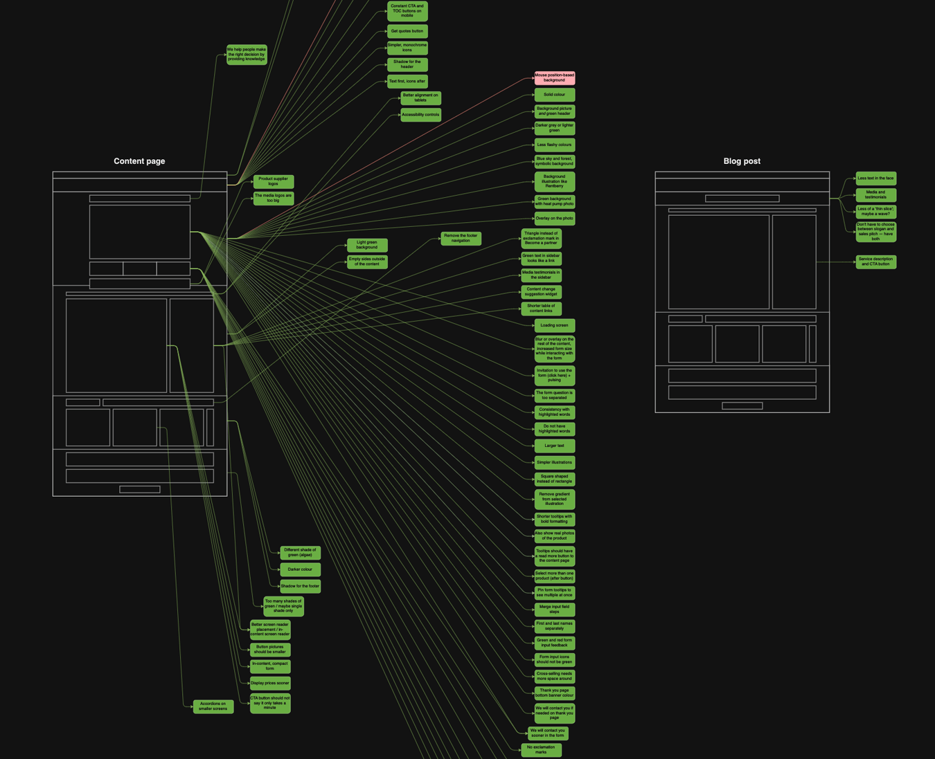
The next step was to conduct interviews with potential clients as well as stakeholders on different levels to answer the following questions:
- Which mockup do real-life users feel is the most easy-to-use?
- What is the ideal product the management would like to see?
- What are everyday problems employees face, considering the CMS was being reconfigured?
- Do the users face problems with understanding the products?
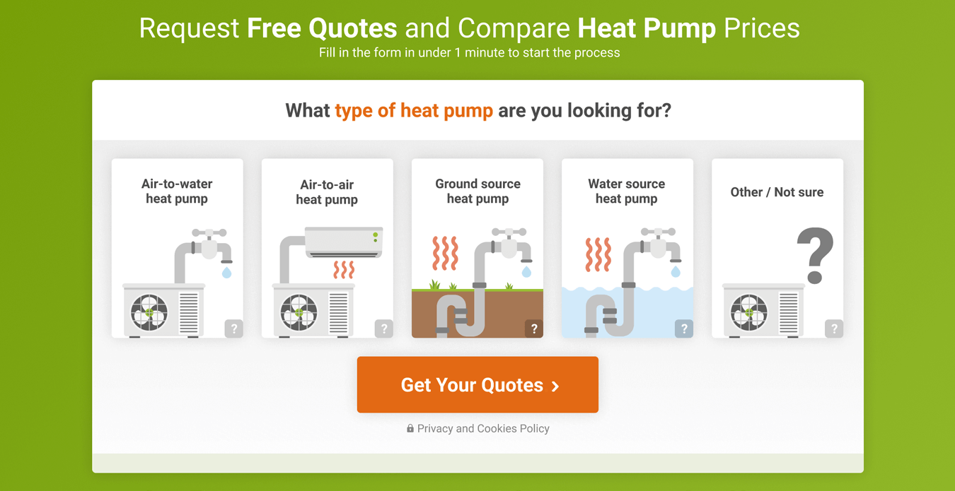
Turns out, due to the technical nature of the products, users often chose 'Other / not sure' in the contact form, as they did not have a full understanding of the products relying only on their jargon names. As a result, I planned to implement a visual form, displayed below; however, this never materialized, as before proper user testing and development could have been conducted, the websites were sold off.
My roles and tools in this project
In this project I have acted in multiple roles:
- User experience strategist: I analyzed user behavior, conducted interviews, and optimized the journey
- Interface designer: I created mockups for each stage of the project
- Front-end programmer: all front-end work is the result of my work, except for the rendering logic of the form
- Back-end developer: I have reconfigured the content management system
To close, the following tools and programming languages have been used:
- Mockups & journey mapping: Figma, draw.io
- Graphic design: Adobe Photoshop, Adobe Illustrator
- Coding: C#, Razor / HTML, Bootstrap / LESS, jQuery
- Support systems: Umbraco, Google Sheets, Asana
Next up:
Lånio.dkWebsite redesign