High resolution, full-length screenshots


On this page:
Timeline
Lånio.dk was founded in 2016 to help people find financing options easily: instead of having to apply to multiple banks for a loan, a Lånio user can sign up at a single place and get multiple offers, from which the cheapest can be chosen.
I have worked on the website on and off between 2019 and 2024, with the most important changes happening in 2022/2023, and fine-tuning in 2024. Simultaneously, I have overhauled Mikonomi.dk as well.

Attila is an exceptional front-end developer, showing a deep sense of responsibility for delivering outstanding results. He contributed immensely to our company's success through his expertise in JavaScript, ASP.NET MVC, C#, and MSSQL, particularly in areas such as UX enhancement, product development, and interface design.
Kasper Nielsen, CTO, Lånio.dk
Problem diagnosis
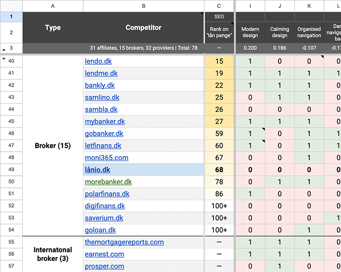
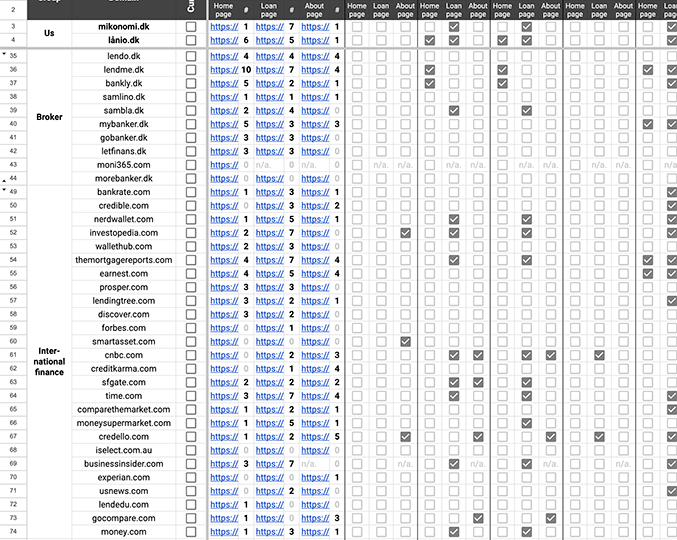
When starting the project, Lånio had no clear brand guidelines. As such, I started with identifying the unique selling points (USPs) and the values it represents. Operating in a fairly saturated market, I also did competitor research to determine what other brands do better or worse, and if there is any inspiration to draw from businesses in other markets that operate with a similar business model.
As per my research, Lånio faced three main issues at that point in time:
- Branding: lacking a clear differentiation strategy
- Standardization: mismatched designs and no holistic view of the user journey
- Conversion optimization: a basic interface on top of a complex process
Branding & standardization
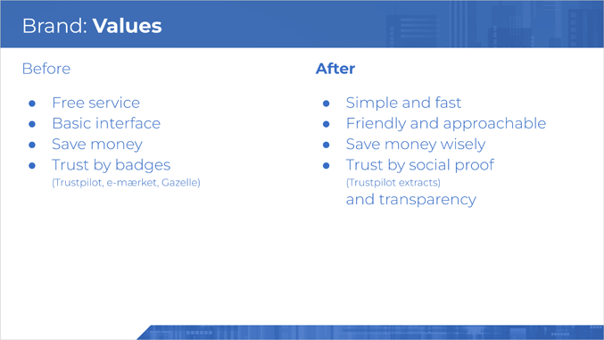
To strengthen Lånio, my focus was on defining a market position that puts Lånio on equal grounds to and beyond the top performers. This involved redefining the brand values:
- Fast: create an interface that makes understanding financing options, filling out the details, and decision-making as simple as possible
- Friendly: be approachable, helpful, and service-minded, both in the visuals but also at each contact point
- Trustworthy: the true differentiator, as most loan comparison websites solely look at their profit margin, Lånio finds sustainable business practices that put the customer first
Modernizing the brand
The original brand and the old version of the website felt cold and unapproachable. Not only did qualitative research confirm this hypothesis, but also the website metrics on Google Analytics showed little engagement from users.
To tackle this problem, these changes were implemented:
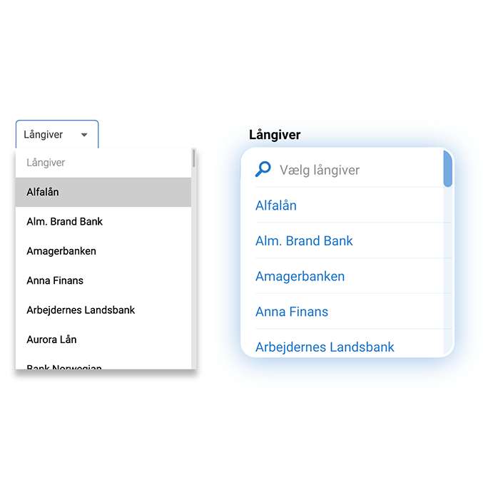
- Simpler language for copywriting to make the understanding of a complex problem as simple as possible.
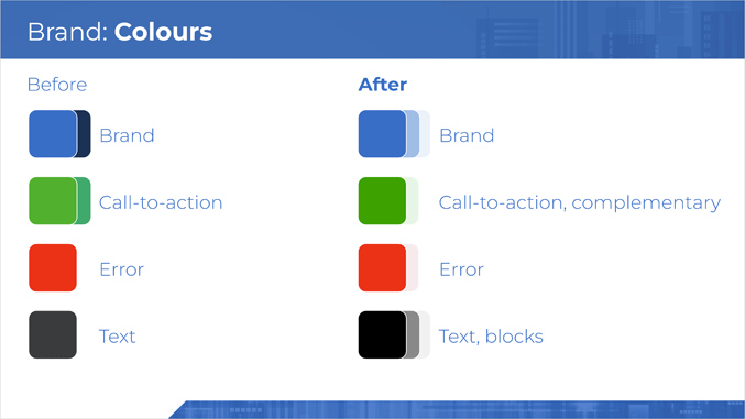
- Brand materials, such as the logo, fonts used, and colors were redefined to provide a more consistent brand image.
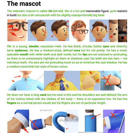
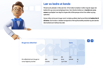
- A mascot was created for the website that has a friendly face and guides and motivates users along the process.
- From the previous basic, angular design, a more modern visual direction was chosen with many soft shapes and airy colors — while at the same time paying attention to accessibility in terms of contrast and color blindness.
- New processes were created to inform users about changes in their applications and provide better access to customer service, who provide a personalized one-on-one experience to them.


Building trustworthiness
Despite having very favorable scores on public review services, Lånio had no social proof present on the website, aside from a few bank logos presented on the top of each page that were used as trustbuilders.
To remedy this, I have used a combination of tactics (which are also displayed below in the same order):
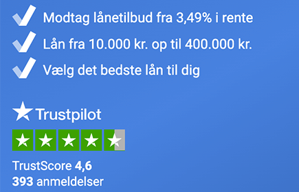
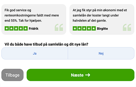
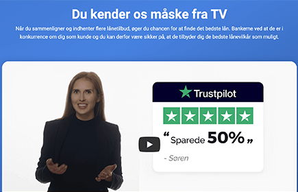
- Trustpilot score displayed in close proximity to the main place of conversion
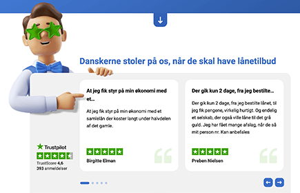
- User reviews on the front page
- User reviews related to the upsells
- Reference to offline media appearances
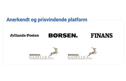
- Highlight of accolades
- Associating the mascot with caring for the user
Regarding the banks' logos, I have identified that instead of building trust, some respondents pointed out that they were rather damaging, as competitive services had more partners, hence more logos. Since the placement was not scalable for many logos anyway (in 2023 there were 12 partners already), I decided the best is not to showcase them on every page. As a result, I utilized the following representation of the partners, which helped maximize logo inventory while utilizing a fun representation instead of dishonesty:
Moving the logos to the front page, Lånio has actually shown an increase in conversion rate, as the interface also got cleaner around the main conversion point.
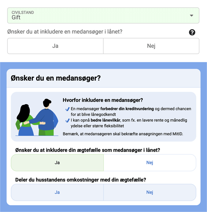
Simplifying the user journey
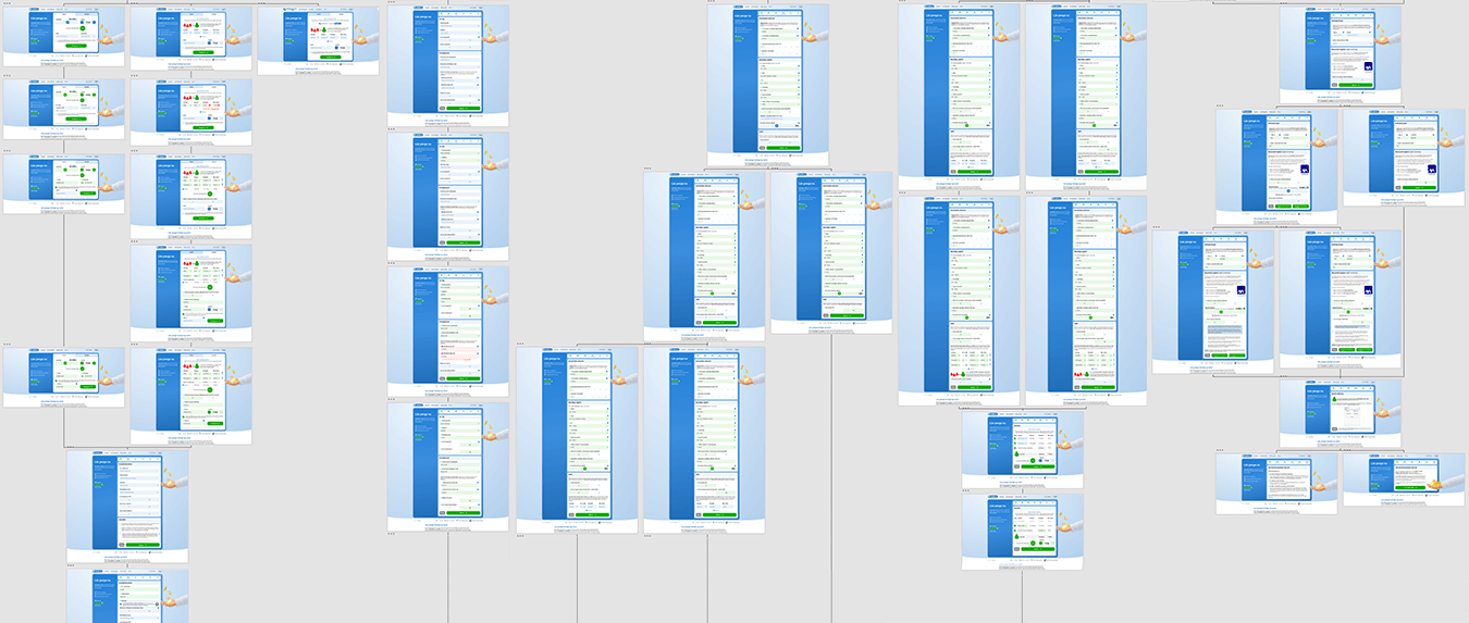
Having a 90+ step journey across multiple business websites (depending on traffic source and chosen bank), it was my priority to make users' lives easy on all fronts Lånio was able to control. This included speeding up the page load time by minimizing the rendered code and optimizing images, and removing any non-essential interaction.
The following was my motto:
Perfection is achieved, not when there is nothing more to add, but when there is nothing left to take away.Antoine de Saint-Exupéry
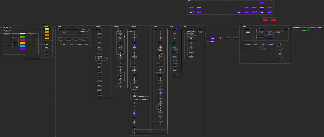
Surprisingly, the key part of the website, the application form, had a great number of flaws that over time got improved in change–test–analyze cycles. I challenged every form element whether they could be removed, and added more context where decision-making was more difficult than a simple 'yes/no' question.
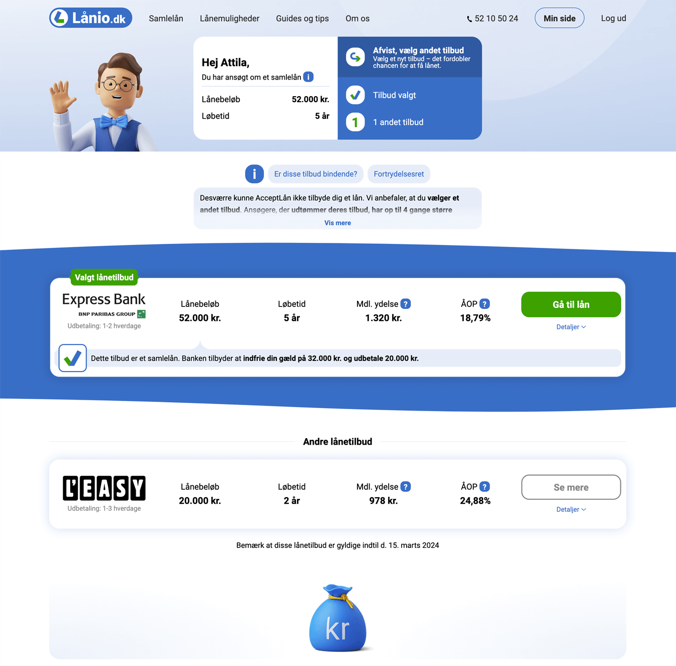
Post-application user experience
The final step that is still in Lånio's control is the so-called portal, where after the application is submitted, the partner banks bid with loan offers to the user. However, this doesn't happen instantly but ranges from a few seconds to waiting for the next business day. Furthermore, the user can even be rejected mid-process eventually.
Therefore, within a limited space, there is a large amount of information to be relayed to the user, including status, loan type and details, upselling and reduced offers, rejections, reselection, etc.
Due to the many different scenarios and considerably lower traffic than before the initial conversion, it was not possible to A/B test changes in the portal, therefore, qualitative research and sequential implementation were applied: the portal was updated as granularly as possible, then large amounts of data were analyzed to figure out how offer confirmation rates and business value were affected. As tests showed, the two were not always correlated: lower selection rates could sometimes lead to higher profits if the users selected loans with the highest payout rates.