Case study: Mikonomi.dk
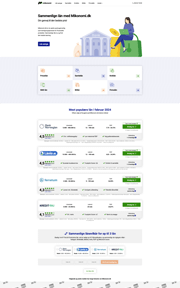
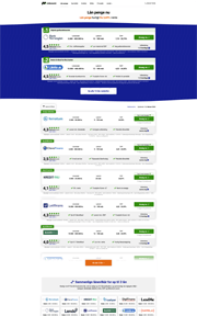
Keeping an affiliate list website fresh and rich in decision-helping featuresHigh resolution, full-length screenshots
On this page:
Timeline
Mikonomi.dk was founded in 2013 to help people find financing options easily and showcases the widest range of lenders in Denmark (at the time of writing).
I have worked on the website on and off between 2019 and 2024, with the most important changes happening in 2021/2022, and fine-tuning in 2023. While working on this project, I have redesigned Lånio.dk as well.
Attila is a rare talent who combines seamlessly productivity, technical prowess, and creativity. He is not only reliable and dedicated but also excels in absorbing new information and taking proactive steps to ensure project success. His work ethic and ability to deliver exceptional results across multiple domains have been remarkable.
Aris Vourvoulias, COO, Mikonomi.dk
Problem diagnosis
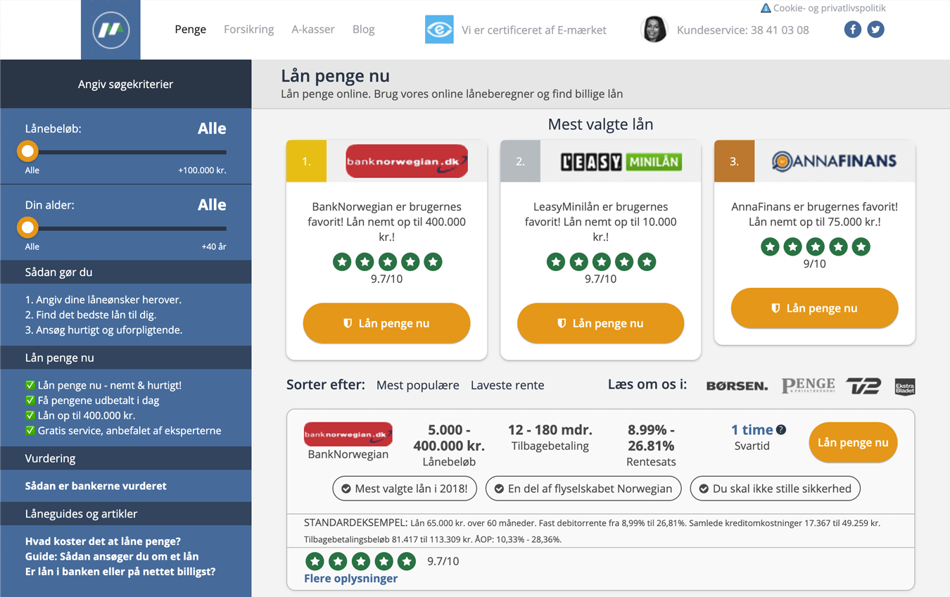
In the beginning, Mikonomi had a rather overwhelming interface and an aging user experience, combined with outdated page performance. As new players entered the market, competition in the search engines got more fierce and Mikonomi desperately needed an update.
With a refreshed design, up-to-date content, and unique features added throughout the project's timeline, Mikonomi has managed to stay one of the top-performing affiliate list websites – even though the market has shifted to preferring other business models (like the aforementioned Lånio).
A feature-rich website
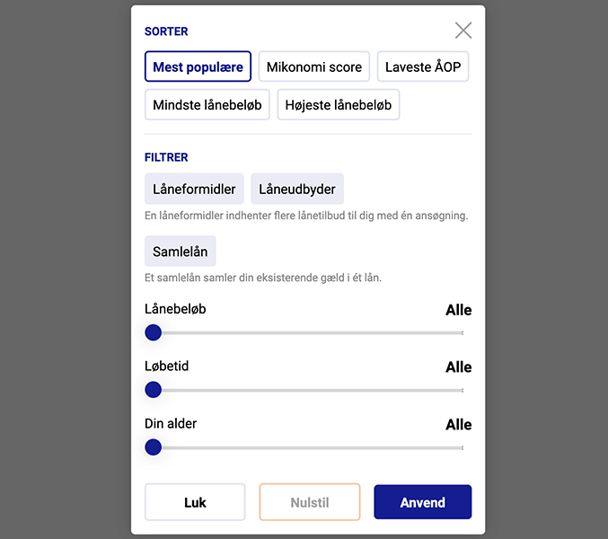
The most important and, as data shows, the most successful task was to follow basic UX principles and create space around the main user tasks. As filters and other non-essential features were moved to popups or spread throughout the page, the interface became cleaner.
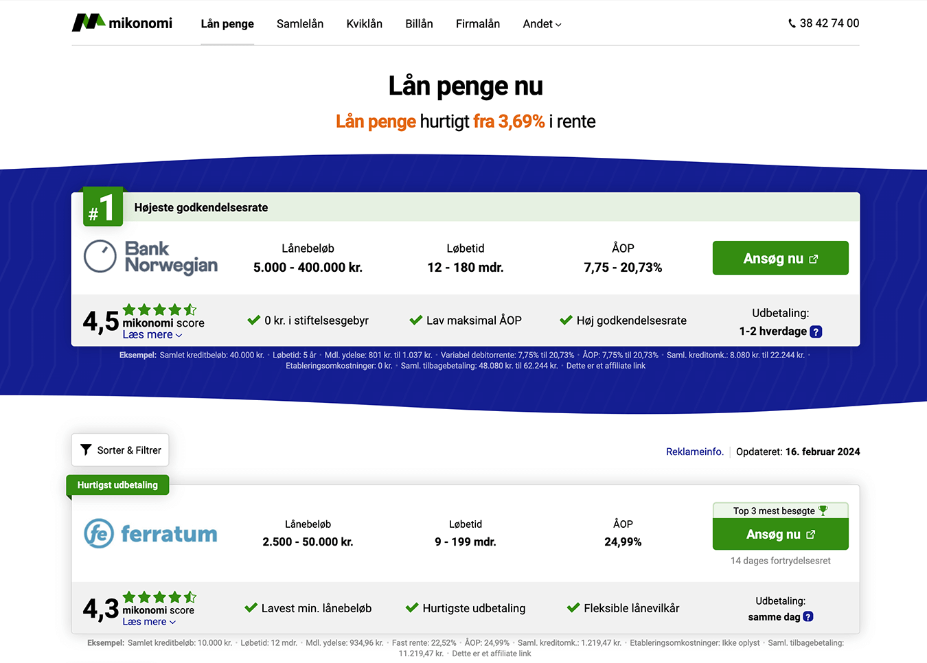
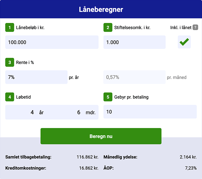
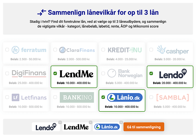
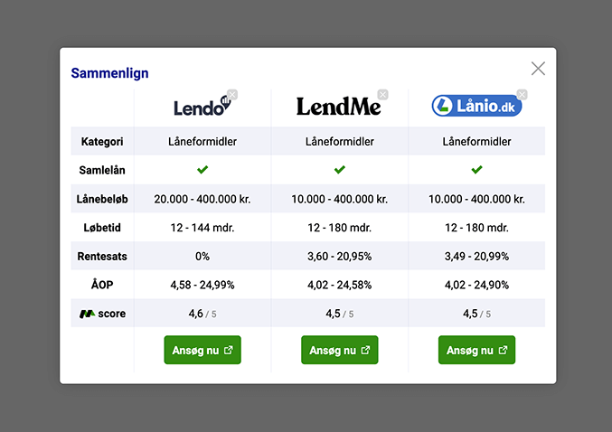
While the interface got more streamlined, the website got richer in features:
My roles and tools in this project
In this project, being a company of only 6 people, I have acted in multiple roles:
- User experience strategist: I analyzed user behavior and optimized the journey
- Interface designer: I created mockups for each stage of the project
- Graphic designer: all visuals have been created and/or edited by me
- Full-stack developer: all front-end and back-end work and CMS configuration have been done by me
To close, the following tools and programming languages have been used:
- Mockups & journey mapping: Adobe XD, draw.io
- Graphic design: Adobe Photoshop, Adobe Illustrator
- Coding: C#, Razor / HTML, Bootstrap / LESS, vanilla JavaScript / jQuery, MSSQL
- Development tools: Visual Studio, JetBrains Rider, GitHub, Copilot
- Support systems: Umbraco, Google Sheets, Trello
Next up:
GreenMatch.co.ukWebsite redesign
Social proof and trustbuilding
Mikonomi being an affiliate list website, the service is mostly directing people to lenders, and as such, the task of making users trust Mikonomi's listed partners was of the highest priority. As the main actor in this, Mikonomi, as the first in the Danish lending industry, introduced the Mikonomi score which offers a low-bias quantitative scoring system, so people can find trustworthy lenders.
This score is calculated based on the cost of borrowing, flexibility, ease of use, and public reviews, among other factors. Mikonomi's audience had a very positive reaction to this, and later direct competitors started to replicate the feature.
Mikonomi has a minimal presence on review sites; as a result, Trustpilot score and similar features were not available for use. That being said, there are other trustbuilders I made use of: